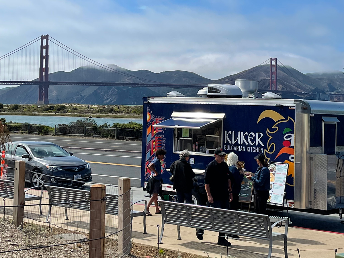
A locally-owned, family-run food truck business in San Francisco, CA.
Overview
My first freelance project came to me when I was asked to help some friends with their food truck’s design. I learned a lot about the design process, facilitating productive client interactions, and time management.
My roles and responsibilities included Visual Identity, Logo Redesign, and Website UX.
Creating Visual Identity
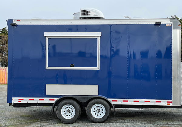
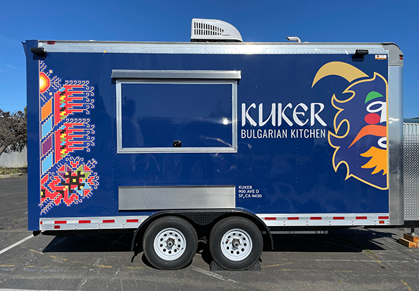
A challenge was to adapt the visual elements to the food truck’s default blue and service window placement.
This created a narrow constraint of available colors and layout options I could use.
After multiple iterations, the solution we decided on was to create an outline around the Kuker logo to contrast the background. Additionally, we wanted the logo to call attention from far away so we decided to scale it up and take advantage of the symmetry by halfing it to make room for the business name without losing it's unique identity.
Logo Redesign
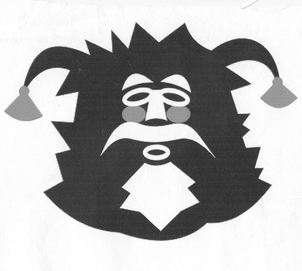
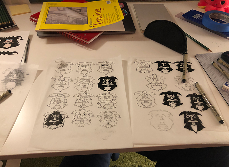
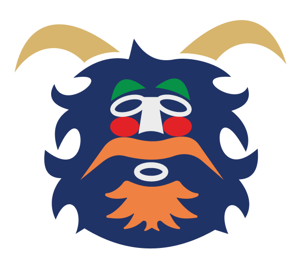
The redesign aimed to modernize the Kuker logo while retaining it's distinct nature. This was accomplished by making it symmetrical, thinning out the head, and keeping the facial shapes of the original.
I worked closely with the family during the redesign. They had an emotional attachment to the original logo which made it hard to explain my thinking process and advocate for changes. Through this process I learned how to present my ideas more effectively and gained empathy for owners of family businesses.
Website UX
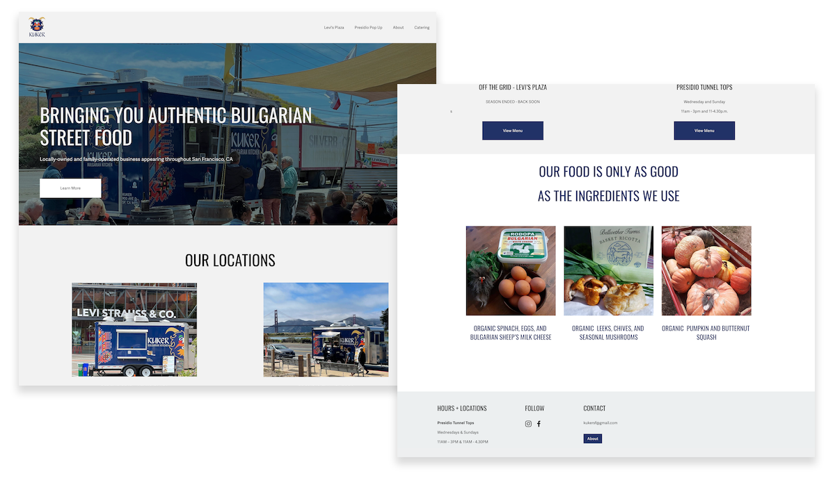
I updated the website's homepage with user experience and business objectives in mind.
The business operates out of two locations so I made sure to direct the user to those while also simplifying the navbar and footer.
visit kukersf.com →